Common Mistakes with Custom Designs
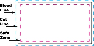
Before we get started, the most important thing to remember is that the black, cut line is not constant. The product can be cut anywhere between the blue and pink dotted lines.
TERMS YOU NEED TO KNOW:
Bleed line
The dashed, blue line is the area that your background needs to fill.
Cut line
The solid, black line marks approximately where your product will be cut.
Safe zone
The dashed, pink line is where important information, such as photos and text, needs to go.
#1. Not Enough Bleed
If you want color or an image to extend to the cut line/edge of your product, the image must extend all the way to the bleed line. Otherwise, you may end up with white space along the edge of your finished product.
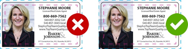
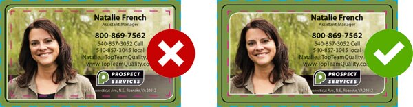
#2. Text or Image Outside the Safe Zone
Anything outside the safe zone is likely to be cut during production. Be sure all text and images are within the safe zone (the pink line) or your product risks looking off-center once cut (unless the image is extended to the bleed line on purpose).
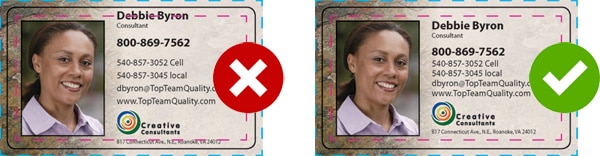
#3. Pixelated Images
The majority of web images (photos from Facebook or websites) cause blurriness or distortion once printed. This is because web images are only around 72 dpi (dots per inch): a lower resolution than what is needed. Your image should be at least 300 dpi and crisp and clear.
#4. Small Text
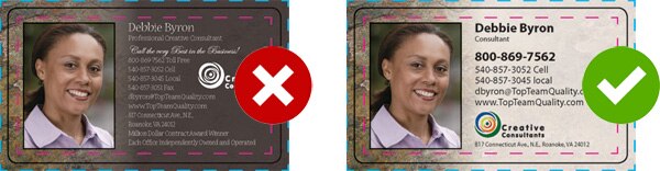
Do not overload your product with too much text, making it hard to read. Also, using small, white text with a serif font on a dark background makes it extremely difficult to read. Use bold fonts that are easy to read.
#5. Border Outside the Safe Zone
If your design has a border, be sure the border's innermost edge is inside the Safe Zone; if the border is just basic color, it needs to extend past the cut line to the bleed line. If your border is outside the Safe Zone it could be cut off during production leaving your design off-center.
#6. Incorrect Resolution and Size
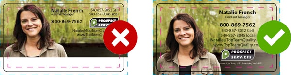
Image resolution needs to be 300 dpi, anything smaller will result in a distorted image on your product once printed. Also, the size of your artwork needs to match the specifications for your product.
#7. Using Registration Black
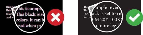
In many design programs, such as InDesign, there is a color called "REGISTRATION" and it looks black. However, registration black is made of 100% coverage in each of the four process colors: cyan (C), magenta (M), yellow (Y), and black (K). This color places too much ink on the sheet of paper, and most often results in blurry text and lengthened drying times. This color should be used only for crop marks and registration marks – which we don’t require on your files.
Looking for a deep black? Use Rich Black, which is a black supported by the other colors. We recommend 30% Cyan, 30% Magenta, 20% Yellow and 100% Black. The subtleties between these blacks is hard to see on screen, but the difference in print output can be drastic, so it is important to pay attention to this.